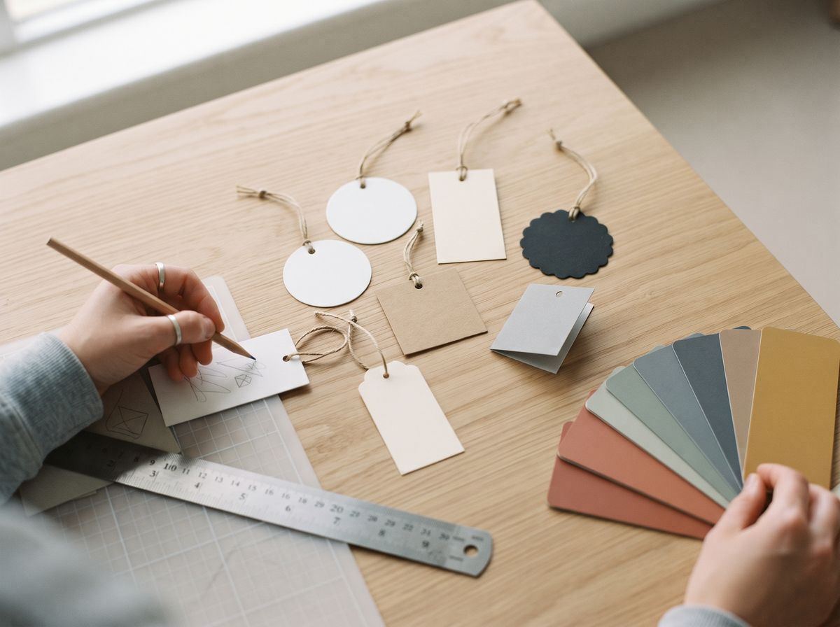
Start with the brand, not the template
A hang tag is the smallest piece of packaging most brands make, and often the one customers touch first. Before opening a design tool, write down three things: who buys the product, the price level, and two or three words the tag should feel like, such as “clean and technical”, “warm and handmade” or “bold and loud”. Every later choice — shape, paper, type, colour, finish — should support those words.
Then decide on the single job of the front of the tag. In almost every case it is to make the brand recognisable from a metre away on a crowded rail. Everything that does not help with that job belongs on the back, on the sewn label, or nowhere. Templates are useful for size and bleed, but a tag designed from the brand outwards looks like yours; a tag designed from a template looks like everyone else's.
Choose a shape and orientation
The outline of a tag is part of the design, and customers notice it before they read anything. The common choices each send a slightly different message.
| Shape | Feels | Works well for | Watch out for |
|---|---|---|---|
| Tall rectangle (portrait) | Classic, orderly | Most apparel; logo at the top, details below | Can look generic without a strong logo or finish |
| Wide rectangle (landscape) | Modern, editorial | Long wordmarks, denim, accessories | Hole placement in a corner or at one end changes how it hangs |
| Rounded corners | Softer, friendlier | Kidswear, lifestyle, beauty | Less sharp and formal than square corners |
| Square | Contemporary, graphic | Monograms, bold symbols, gifts | Less room for text on the back |
| Circle | Playful or crafted | Candles, food, handmade goods, eco brands | Text must sit inside a curved safe area |
| Notched or classic tag shape | Traditional, vintage | Heritage, workwear, kraft tags | Easy to look like a stock luggage tag |
| Custom die-cut | Distinctive, memorable | Brands with a strong symbol or outline | Fine points and narrow necks can tear |
| Folded or booklet | Premium, story-led | Brand stories, size guides, collections | More copy to write and check |
Portrait tags with the hole at the top are the default on clothing because they hang straight and the logo sits at eye level when the tag is lifted. Standard dimensions, hole sizes and positions are in our hang tag sizes guide. For a shape that is truly yours, a custom die-cut is a flat +$30 per order.
Lay out the front and back
Think of the front as a poster and the back as a form. On the front, give the logo room: as a starting point, let empty space take up at least half the area. On the back, group information so a shop assistant can find the price and size in a second.
Front layouts that work
- Centred logo. The logo sits in the optical centre, slightly above the true centre so it does not look as if it is sliding down. The safest and most timeless layout.
- Logo at the top, pattern below. A brand pattern or texture fills the lower part of the tag, with the logo in a calm area near the hole.
- Edge-to-edge colour. A solid brand colour bleeds off every edge, with the logo reversed out in white or foil. Bold and very recognisable on a rail.
- Small logo, big space. A small mark in one corner and nothing else. Reads as quiet and expensive, especially on a textured or heavy stock.
- Vertical wordmark. A long brand name runs up the tag. Useful when the name is long and the tag is slim.
Back layouts that work
Use a simple grid: product name and colour at the top, size in a clear box, barcode and SKU at the bottom where scanners and tagging staff expect them, and the website or QR code in a quiet spot. Leave a blank area if prices are added by sticker. The full content checklist is in what to put on a hang tag.
Typography that reads at tag size
- Use no more than two typefaces. One for the brand and headings, one plain face for information. Many good tags use a single family in two weights.
- Size small text for real life. Print the back at actual size and read it at arm's length. If you have to squint, so will the customer.
- Be careful with thin fonts. Hairline weights break up on kraft and textured paper, fill in when reversed out of dark colours and disappear under foil.
- Set prices and sizes in a clear, solid weight. These are the details people look for, so give them contrast.
- Convert fonts to outlines before you send the file, so the printer cannot substitute a different font.
Colour and paper together
Colour on a tag is never just the ink: it is the ink on a particular paper. The same blue looks bright on coated white card, darker on uncoated card and muddy on brown kraft. Choose the paper and colours together.
| Paper | Colour that works | Colour that struggles |
|---|---|---|
| Coated white card | Full colour, photos, bright brand colours, fine detail | Very large solid areas can show scuffs unless laminated |
| Uncoated white or cream card | Soft, muted palettes, one or two inks | Neon and very bright colours look flatter |
| Kraft | Black, white ink, dark colours, gold foil | Light colours and full-colour photos |
| Black card | Foil, white ink, spot UV, deboss | Ordinary coloured ink, which disappears |
| Textured or cotton paper | One colour, foil, deboss | Fine lines and small type |
Give Pantone references for brand colours so reprints match. Our hang tag paper types guide covers each stock in more depth, and the artwork preparation guide explains Pantone and CMYK.
Use finishes as design tools
A finish works best when it does one clear job. Choose one hero finish and let the rest of the tag stay quiet.
| Finish | What it does in the design | Best paired with | Price with us |
|---|---|---|---|
| Foil stamping | Makes the logo catch the light; signals premium | Black card, kraft, deep colours | +$25 per order |
| Debossing / embossing | Adds depth you can feel; quiet luxury without ink | Thick, uncoated or textured stock | +$20 per order |
| Custom die-cut shape | Makes the outline part of the brand | Bold symbols, simple outlines | +$30 per order |
| Matte or gloss lamination | Protects the tag and gives a smooth feel | Coated card, dark colours | Free on standard tags |
| Spot UV | Gloss highlight on a matte surface | Laminated coated or black card | Quoted |
| Painted edges | A line of colour around a thick tag | Layered board | Quoted |
Layering finishes — foil, deboss, spot UV and a die-cut on one small tag — often looks busy and multiplies the cost. A single debossed logo on heavy uncoated card can look more premium than all four.
Hang tag design ideas by brand style
These combinations are starting points, not rules. Use them to test a direction quickly, then adjust to your own brand.
| Brand style | Shape and size | Paper and colour | Finish | String or fastener |
|---|---|---|---|---|
| Minimal and modern | Slim portrait rectangle | Bright white coated or uncoated card, one dark ink | None, or a small deboss | Thin white or black cotton string |
| Eco and natural | Rectangle or circle | Recycled kraft or uncoated card, black ink | Deboss; skip lamination | Cotton, jute or hemp twine |
| Luxury and evening wear | Portrait rectangle, slightly larger | Dyed-through black or layered board | Gold or silver foil, or deboss | Satin ribbon or waxed cord |
| Streetwear | Wide rectangle or custom die-cut | Bold brand colour edge to edge | Spot UV or a single foil | Coloured string or a plastic fastener |
| Kidswear | Rounded corners, smaller size | Coated card, bright friendly palette | Matte lamination | Soft string; avoid sharp fasteners |
| Outdoor and technical | Rectangle with clear grid | Synthetic or laminated card, high contrast | None needed | Plastic fastener or strong cord |
| Handmade and artisan | Circle, notched tag or small square | Cotton or textured paper | Deboss or letterpress-style impression | Natural twine |
To see some of these directions as editable files, start from our free hang tag templates. For a natural look in production, see kraft hang tags and eco-friendly hang tags.
Design with the product
A tag is never seen alone. It hangs against a fabric, a colour and a price point, and it should look like it belongs there.
- Check the colour against the garment. A navy tag on a navy jacket disappears; a contrasting or neutral tag stands out. Lay a printout on the actual product.
- Scale the tag to the product. A small tag can look lost on a heavy coat, and a large tag can swamp a pair of socks.
- Match the string to the tag. String colour and material finish the design. See hang tag accessories.
- Think about how it hangs. The hole position decides which way the tag faces. Our guide on how to attach hang tags shows where tags sit on different garments.
- Keep the tag and sewn label consistent. The same logo, colours and type on the hang tag and the woven label make the product feel like one brand.
Print-ready checklist
- Document size equals the finished tag size, plus bleed on every edge (3 mm, or 1/8 in, is a common amount).
- Background colours and images extend into the bleed so no white edge shows after cutting.
- Important text and logos sit inside a safe area a few millimetres in from the cut line.
- The hole is marked on a separate layer, with nothing important near it.
- Die-cut outlines are a single vector path on their own layer.
- Foil, deboss and spot UV areas are each on their own layer in solid black, one layer per finish.
- Fonts are outlined and images are at least 300 dpi at actual size.
- Colours are given as Pantone references where they must match.
- Barcodes are generated from the real number at a scannable size, with a quiet zone around them.
- A test print at actual size has been checked next to the product.
Not sure your file is ready? Send it as it is. We check every file, set it up for print and send a proof before anything is made.
Common design mistakes
- Everything on the front. Logo, tagline, website, social icons and price compete with each other. Choose one focal point.
- Designing only on screen. A tag that looks balanced at 400% zoom can feel crowded at real size. Print it.
- Ignoring the paper colour. Light inks on kraft or coloured ink on black card simply disappear.
- Too many finishes. One hero finish is stronger and cheaper than four.
- Logo too close to the hole or the edge. Cutting and punching tolerances can clip it.
- A shape that fights the product. Sharp corners on kidswear or a huge tag on a small accessory.
- Not checking the barcode. Scan a printed proof before approving a full run.
Ready to make it real? Request a quote on our custom hang tags page, or order the sample pack to see papers and finishes in your hand first.